

Your homepage leaves a strong first impression on the people who visit your site. And first impressions are everything.
In fact, researchers out of Princeton University found that people make judgments in just a fraction of a second. And those first impressions are difficult to change.
The same is true on your website.
The quality of your homepage can make all the difference whether your website attracts new business or losses online bookings.
Here are five simple steps you can take to improve your tour or activity website’s homepage, and create a great first impression.
1. Write a Captivating Headline
Website traffic can vary as much as 5x based on your headline.
According to Peter Koechley of Upworthy, who makes his editors write at least 25 different titles for each piece of content they write:
“The difference between a good headline and a bad headline can be just massive. It’s not a rounding error. When we test headlines we see 20% difference, 50% difference, 500% difference.”
A good headline doesn’t just introduce visitors to your site.
It encourages more visitors to stay. To explore. And ultimately, to make a booking.
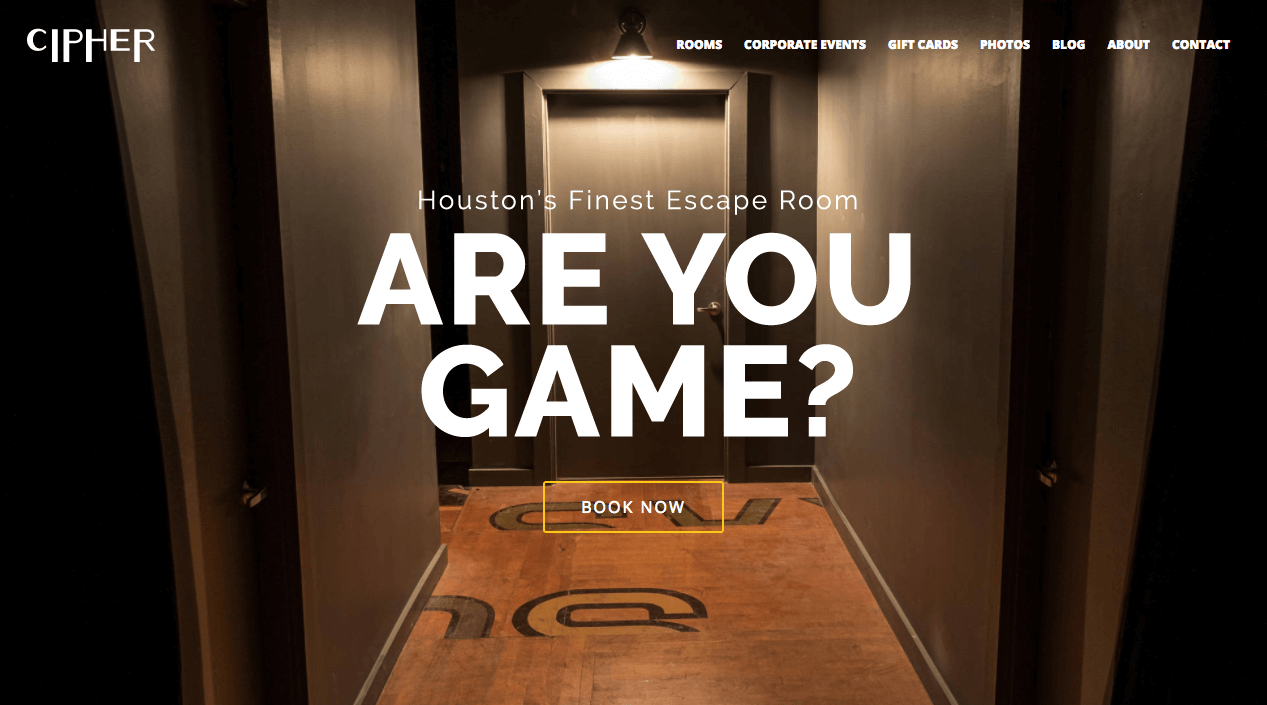
Cipher Escape Rooms creates intrigue with a simple question: Are You Game?
How to Optimize Your Headline
Focus on Your Unique Value Proposition
Your headline should clearly convey your unique value proposition (UVP).
In short, your UVP explains why visitors should choose you over the competition. Think about it this way: without a reason to book with you, there’s nothing to optimize.
Your headline should clearly state what you do, who your audience is, and what makes you unique.
Read more: How to Write a Unique Value Proposition That Gets More Bookings
Try the 8 Second Test
A clear headline is informative but easy to read.
According to a new study from Microsoft, people generally lose concentration after eight seconds.
Test the clarity of your headline by asking, “does my headline catch (and keep) the visitor’s attention in eight seconds or less?”
Speak Their Language
Borrow language from your customer reviews. How do they describe your offering? What do they love about it?
Don’t over-polish their words. Instead, use the same words your customers use. It’s easier to connect when you are speaking the same language.
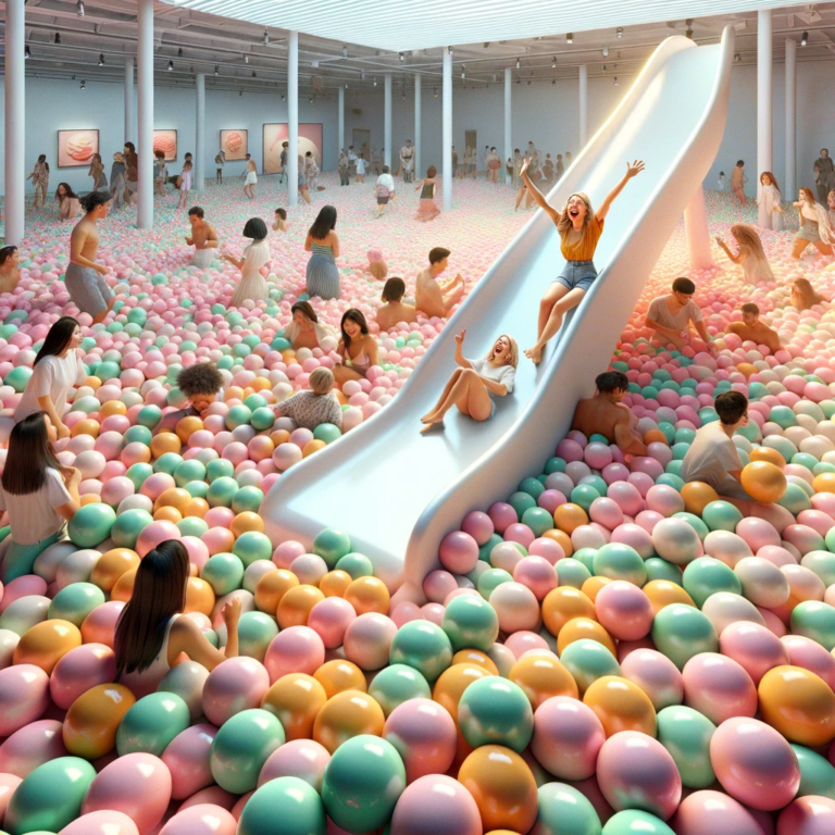
2. Choose an Eye-Catching Image (or Video)
The first thing visitors see when they land on your homepage is your “hero image.”
A hero image is a large banner image (or video), prominently placed on your homepage. The hero image is often the first thing visitors see, along with your headline. It draws people in and gives them a clear idea of what your business offers.
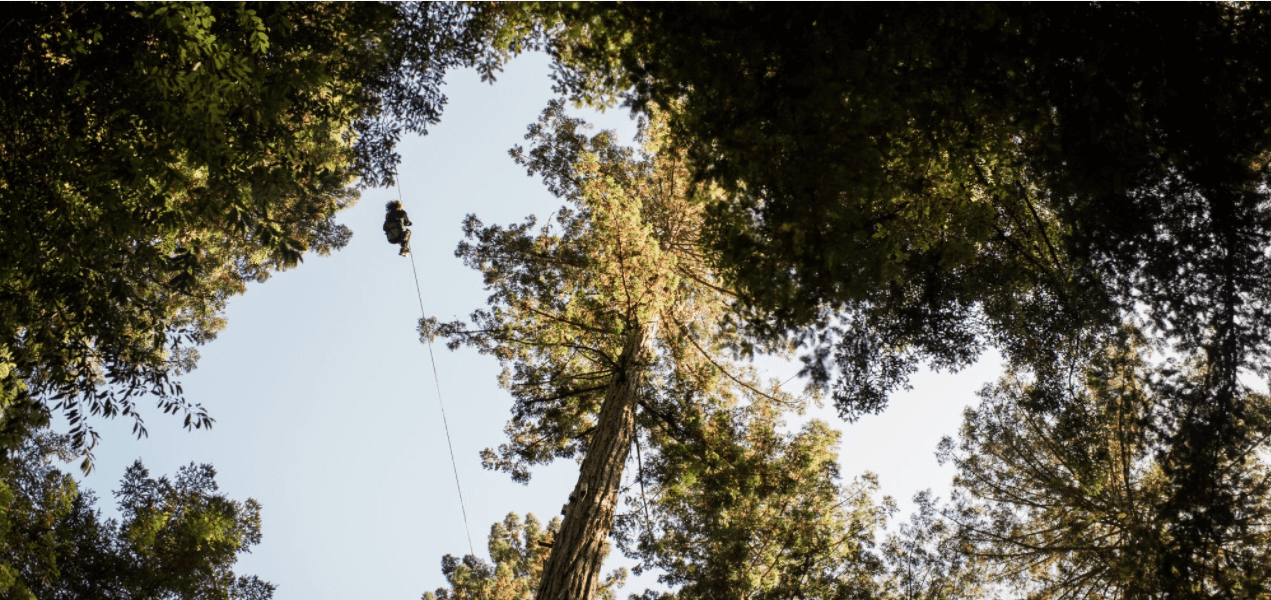
Sonoma Canopy Tours puts you in the harness with a looping video that leaves you aching for more.
Where your headline connects with the visitor’s brain (giving them a reason to book your offering), your hero image connects with their heart (creating an emotional connection).
And emotions are what really drive bookings.
Thing about it… do you go on a tour or do an activity because it seems reasonable, or for the experience?
A high-quality and engaging hero image evokes strong emotions. It boosts the visitor’s sense that your company is trustworthy, competent, and likeable – increasing the chances that your first-time visitor becomes a paying customer.
How to Optimize Your Hero Image
Support Your Headline
Your hero image is the visual representation of your headline. It should create intrigue and reflect your unique value proposition.
Use High-Quality Photos
Always use professional, high-quality photos. Pixelated, blurry, and amateur looking photos create a bad first impression that might hurt your bookings and conversion rates.
Resize for Retina Displays
Retina displays have 4x the pixels of standard screens, so smaller images become pixelated when they are stretched to fit retina screens.
As a rule of thumb, choose a high-quality image with a width of 2880 px. It matches the dimensions of a 15” retina display, and is twice the pixel width of a normal desktop screen.
3. Create a Clear Call to Action
Visitors who don’t click don’t book.
A “Call to Action” (CTA) is a button or text that tells the visitor what action you want them to take next, and encourages them to continue to the next page (like the booking page).
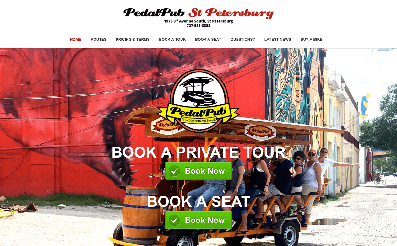
Pedal Pub St. Petersburg uses Xola’s classic green “Book Now” buttons because they stand out and draw the visitor’s eye, encouraging them to make a booking.
For first time visitors, your call to action might say “Learn More” and direct them to an activity page that describes your offering in more detail. For repeat visitor, your call to action might encourage them to become customers using a clear “Book Now” button.
A powerful call to action also creates urgency. It provides visitors with a compelling reasons to act promptly, instead of deferring buying decisions for later.
How to Optimize Your Call To Action
Make It Stand Out
Your call to action should stand out. It should be large enough that it is easy to see, even if you aren’t wearing glasses.
Your call to action should never blend in. Make it more noticeable by using colors that contrast with your website’s standard colors.

Don’t let your call to action blend into the background. Use contrasting colors to help it stand out.
Consider the Booking Cycle
A well crafted call to action matches what the visitor is looking for. A new visitor to your site is unlikely to respond to “Book Now”. They are still learning about your company and offerings. Consider your visitors’ needs according to where they are in the buying cycle.
4. Promote Your Best Offers
Showcasing your popular activities on your homepage gives you the chance to focus on what you do best. It encourages discovery and persuades visitors to consider your offerings, pushing them psychologically closer to making a booking.
Highlight a few of the best offerings with captivating imagery, a short description, and a clear call to action that encourages visitors to click through.
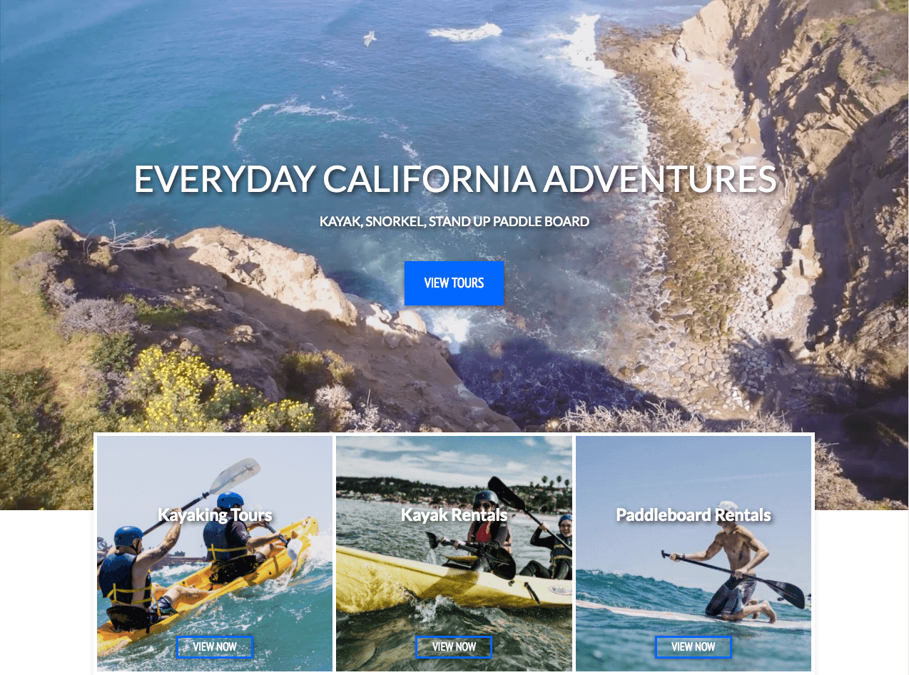
Everyday California puts their featured activities front and center, encouraging new visitors to explore their favorite tours and rentals.
How to Optimize Your Featured Activities
Be Human
Studies show that images with human faces create a positive emotional response and increase conversion rates.
Ensure your imagery is compelling and relevant by using photos that display real people enjoying your activities.
Reduce Decision Fatigue
People are bad at making decisions. The more options we are given, the less likely we are to take action.
Focus on a few featured activities to reduce decision fatigue and improve the likelihood that your visitors will proceed to select an activity and book it.
Encourage Discovery
It can be tempting to lead visitors directly from your featured activities to the booking checkout process. But that’s a surefire way to drive new visitors away.
Put simply, you can’t force people to do something (i.e. make a booking) if they don’t want to or aren’t ready.
Instead, encourage discovery by leading visitors to your activity pages where they can learn about the activities you offer and decide whether or not they want to book.
5. Add Social Proof
According to LocalBright, 88% of consumers trust online reviews as much as personal recommendations.
It’s no wonder, then, that your presence on TripAdvisor and Yelp is so important.
But there’s no reason to stop there.
Adding “social proof,” like testimonials and review badges on your site have the same effect. They can dramatically increase trust and improve the chances that people book on your website.
How to Optimize Your Reviews
Support Your Unique Value Proposition
Showcase testimonials that reinforce the things that make you great. Find a quote that directly addresses your value proposition and put it front and center on your homepage.
Address Their Fears Early
Anxiety has a powerful psychological effect that can quickly drive visitors away. Use customer testimonials to provide credibility and address your visitors’ fears early on.

All at once, a great review can help promote the experience and addresses the visitor’s anxiety (like Linda’s fear of heights).
Flaunt the Numbers
If you have a 5-star rating on Yelp or TripAdvisor, show it off. If you have some other award, like #1 attraction in the area, flaunt that too. There’s no harm in a bragging if you can back it up.
Conclusion
The homepage is often the most visited page on your website. It creates a vital first impression that is hard to erase, so make it a great one!
These five tips provide actionable ways for you to boost your likeability and improve the chances that people make bookings on your website.
This is the first installment of our Conversion Science blog series. In our second installment, we discuss 5 ways to optimize your activity pages.