

The ease of your checkout process is one of the most significant factors that increases your website conversion rates. But it’s often the most neglected.
In our last installment, we covered the online booking loop and provided you with 3 simple rules for a great online booking experience. In this installment, we dig deeper into the online checkout experience, focusing on effects of design on website visitors and subsequent bookings.
Here we go….
According to the Baymard Institute, a well known usability research institute, the average checkout can see a 35.26% increase in conversions through improvements in design.
In part, the checkout experience is neglected because booking software providers handle the design, not you. Yet few providers have taken significant steps to understand, and improve, the online checkout experience.

At Xola, we take this responsibility seriously. We believe that your online booking software should help you get more bookings, not less.
Here are eight common checkout usability mistakes that most booking software providers make, which frustrate your site visitors and costs you lost revenue.
Mistake #1: Breaking the Booking Loop
If you remember one thing, it should be this: never break the booking loop.
Separating the elements of the booking loop (quantity, date, and time) across checkout pages increases the effort visitors have to make to browse availability, leading to stress, frustration, and higher rates of booking abandonment.

Solution: Keep It on the Same Page
Keeping the booking loop on the same page makes it easy for visitors to find availability and make their booking online. Less back-and-forth between pages reduces frustration and increases conversion rates.

Mistake #2: Ditching the Group
If your availability is full for a specific time and date, most customers would rather change the selected time slot than drop friends or family from the group. But many checkout designs don’t recognize this. They prioritize date and time preferences over happy friends and family.

Put yourself in their shoes, If you were planning for a group, and the time slot you want isn’t available, would you pick a different time? Or ditch a friend?
Solution: Put the Group First
Always ask for quantity first. Dates and times can be adjusted to accommodate the group.
After all, experiences are meant to be shared.

Mistake #3: Information Overload
Information overload refers to the sensation visitors get when websites cram too much information into a small space. The result is that visitors feel overwhelmed and frustrated. People don’t like information overload, and will be more likely to leave your site without completing their booking when confronted by it.
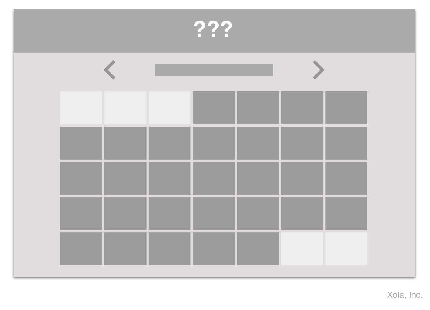
Full-page calendar designs are a great example.
They seem straightforward… But when you’re dealing with multiple layers of dates, times, and capacities, it can get very confusing very fast. Full-page calendars rarely work if you offer more than one or two time slots a day. Especially on smaller, mobile screens when you can hardly view more than one day at a time.

Solution: Separate Steps for Clarity
Instead of using a full-page calendar, display quantity, dates, and times as separate and distinct elements. Consider using a number selector for quantity, a calendar for dates, and displaying available time slots in a list.
That way you still get the same result (i.e. a calendar), but you spare your visitors the feeling of information overload.
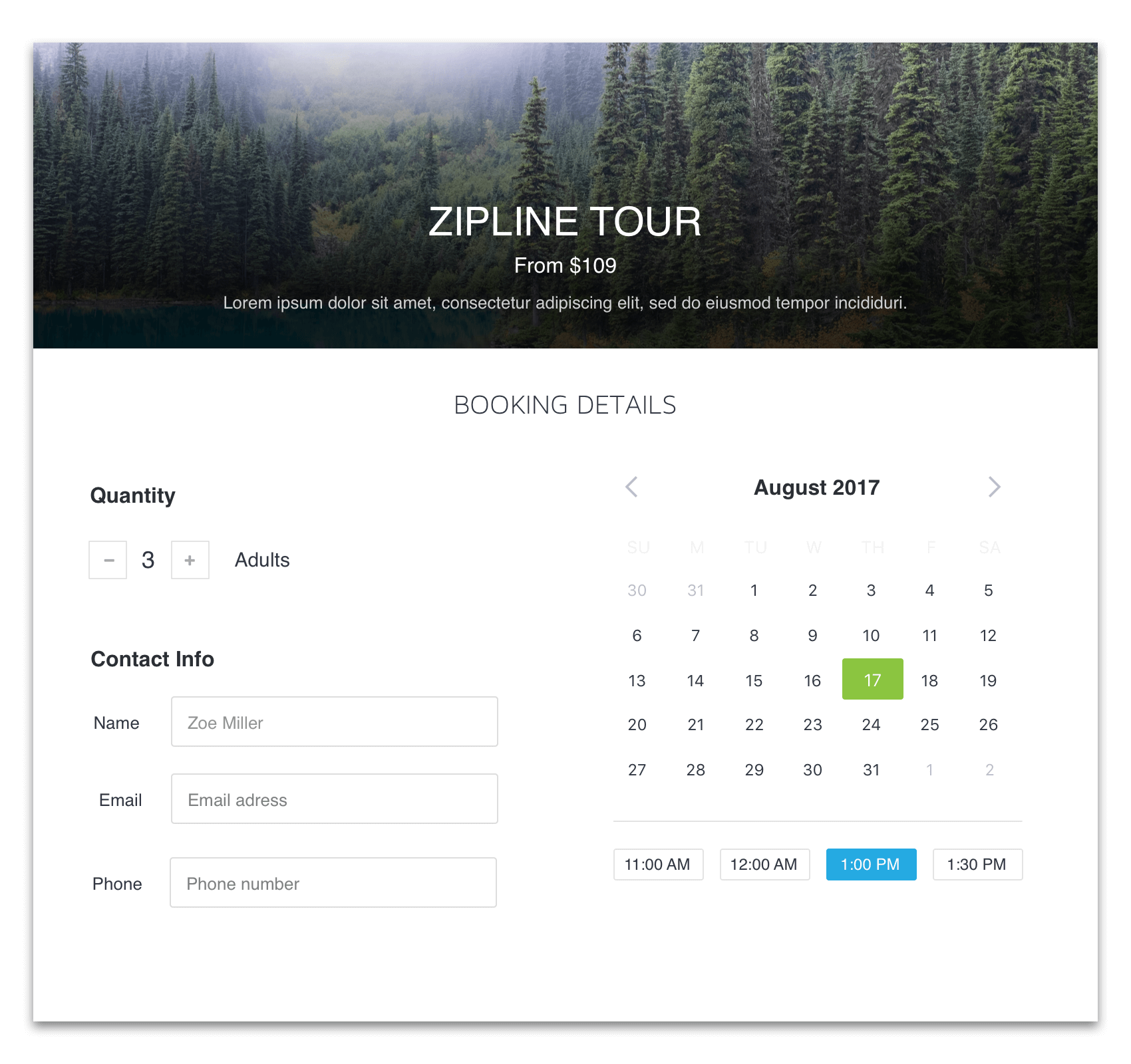
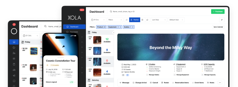
Xola’s optimized checkout displays quantity, date, and time as separate elements.
Mistake #4: The Embedded Checkout
Embedding the checkout in a webpage can be appealing. It makes the checkout blend in with the rest of your site and helps you maintain a consistent brand experience.
But the last thing you want to do is make your checkout “blend in.”
Embedded checkouts distract site visitors from the primary goal of completing the purchase by pulling a great deal of focus towards non-vital elements, like your navigation bar or hero image.
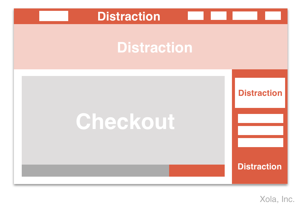
Every element on the page matters. Additional elements, like navigation options and images, distract visitors from the primary goal of completing their booking.
Solution: The Enclosed Checkout
The number of elements displayed during the booking process should be reduced to a minimum so that your visitors can focus on the main task: completing their booking.
The practice of hiding surrounding website elements during checkout is also known as an “enclosed checkout.” It might seem like a small detail, but in practice it can have a dramatic effect.
According to the Baymard Institute, when testing split-tested enclosed checkout designs,
“It is not uncommon to provide a conversion rate increase of 3-10% – solely from removing the main site-navigation and similar non- checkout related elements.” (The Baymard Institute)
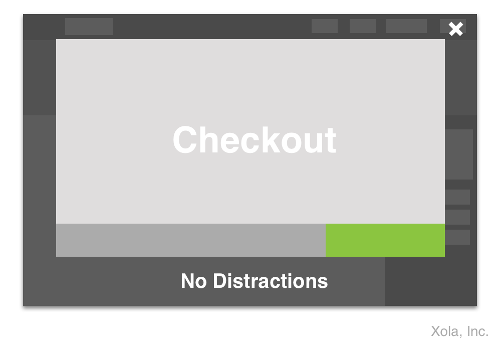
A simple way to create an enclosed checkout is to gray out anything outside of the checkout module . The enclosed checkout helps avoid distraction without forcing visitors to leave your website.
Mistake #5: Tiny Text
With nearly three thirds of US adults using some sort of vision correction device (Vision Council of America), online readability is an issue that affects a vast majority of your website visitors.
If visitors can’t read the text, they can’t navigate the checkout. If they can’t navigate the checkout, they can’t make a booking.
However, many checkout designs are built with font sizes as small at 12 pixels. In website terms, that’s tiny… And very hard to read – even for people with 20/20 vision!
For perspective, text printed in a book or magazine is about the same size as 16 pixels on a website. Here’s how the different text sizes stack up next to each other:
This is a 12 pixel font. It is difficult for the average reader to see, and nearly impossible for people with impaired vision.
This is a 14 pixel font. It is an acceptable size for secondary text.
This is a 16 pixel font. It is the text size browsers display by default, and a similar size to most books and magazines. It is the ideal size for primary text.
Solution: Make It Readable
The primary text on your checkout should be 16 pixels or larger. Secondary text should be no smaller than 14 pixels. This ensures that the average visitor can navigate your checkout without needing extra help.
For the visually impaired, make sure they can easily increase the text size by zooming in and out on their desktop or mobile phone. Or, use accessibility functions which automatically increase the font size when selected. Not only will your visitors thank you, Google’s indexing algorithm likes it too.
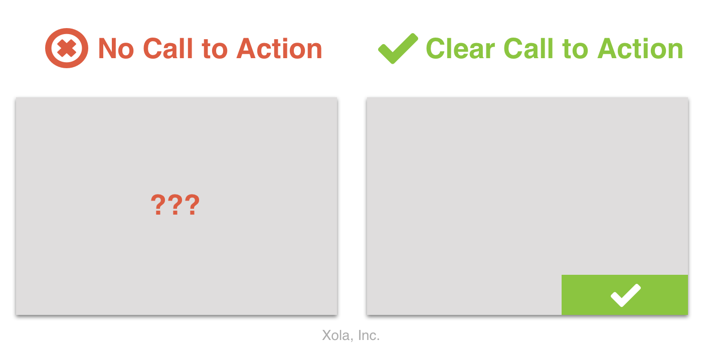
Mistake #6: No Clear Call to Action
Fast and efficient checkouts require that visitors can quickly skim every step of the checkout and understand how to proceed in the booking process.
The Call to Action (CTA) is the button or text link that visitors use to proceed to the next step in the booking process.
An obscured or non-existent CTA will slow visitors down and cause higher rates of cart abandonment. It forces visitors to stop in their tracks, examine the booking interface closely, and all the buttons within it, to understand how to proceed and make a purchase.
A checkout without a call to action begs two anxiety-inducing questions: (1) “How do I proceed to the next step?” and, (2) “What is the next step?”
Solution: Prominence, Placement, and Uniqueness
Once the call to action is visible, there are three considerations that are proven to directly impact visitors’ ability to proceed through the booking process:
Prominence
A clear CTA should always be visible. Visitors should be able to quickly understand how to advance from one step to another in the booking process at any point in time. The absence of a call to action leads to confusion, uncertainty, and higher rates of booking abandonment.
Placement
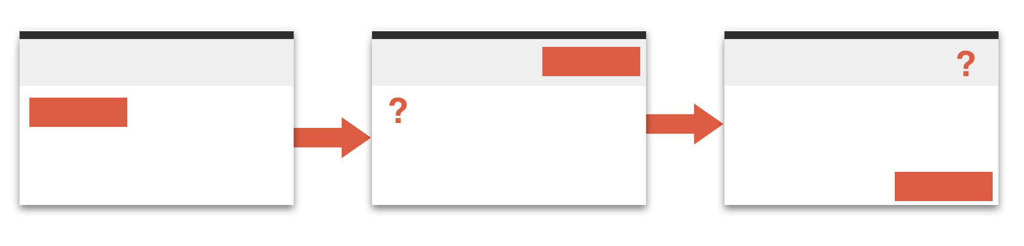
A CTA should be placed in the same location on each page to create consistency and avoid confusion.
According to the Baymard Institute, “Users will often look for the primary button [CTA] in the lower-right corner of the form section, which makes sense since that’s where many traditional multi-step checkouts have their buttons.”
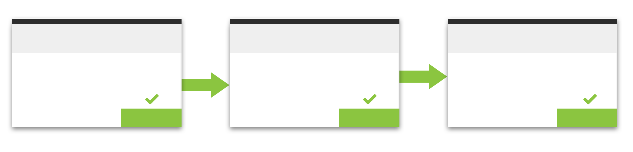
Xola’s checkout is designed with a call to action that is always positioned in the bottom right corner of the screen.
Uniqueness
The CTA should stand out from the other elements on the page. Surrounding the button with other bold colors, attention grabbing buttons, logos, and images, will cause unnecessary distractions and make the CTA hard to see.
Additionally, try avoid using a button color that blends in with the rest of your site’s color scheme. Instead, opt for a contrasting color, like bright green, to make your CTA really stand out.
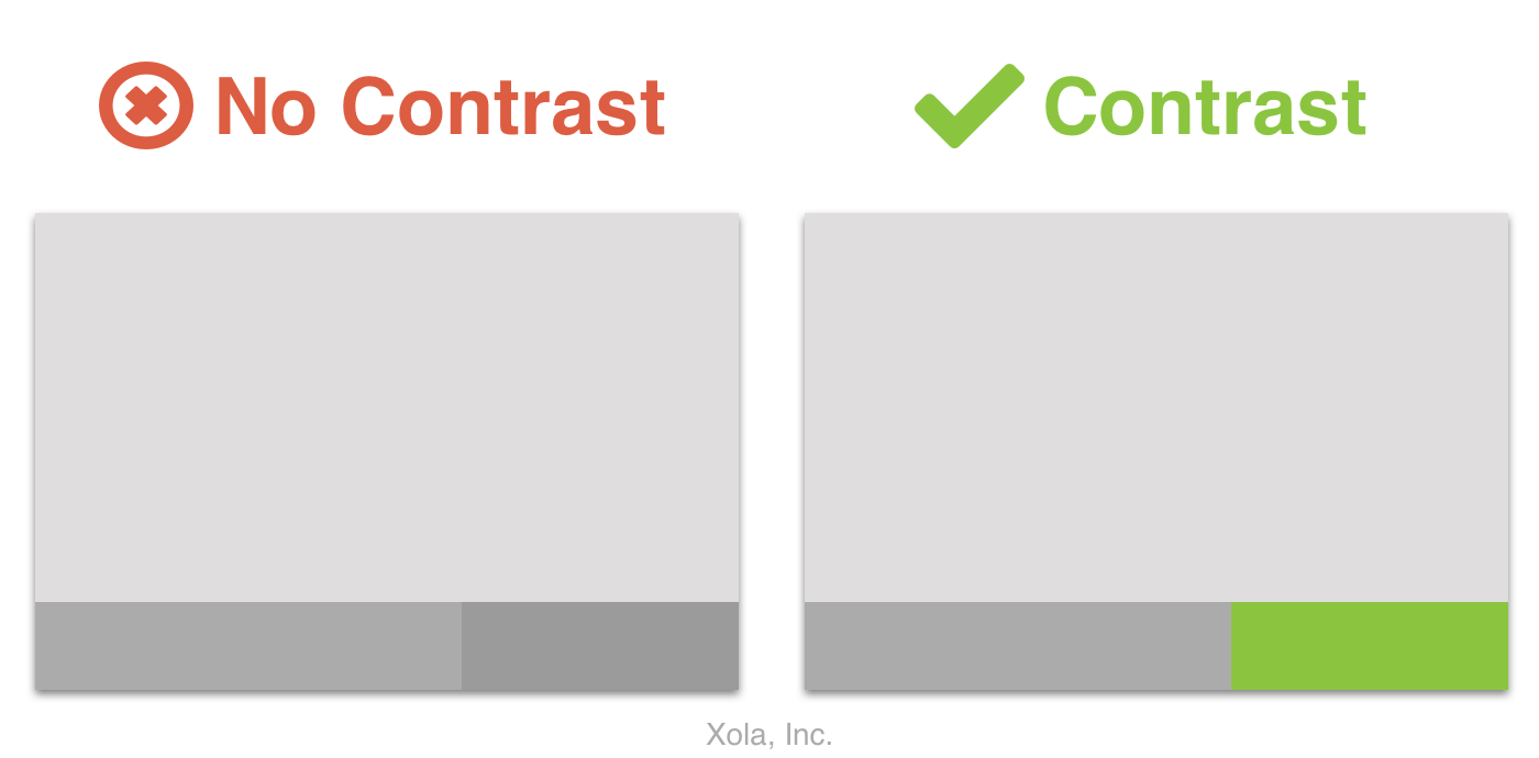
Don’t let your call to action blend into the background. Use contrasting colors to help it stand out.
Mistake #7: Validation Errors and Data Persistence
Have you ever entered your credit card information wrong, only to have the info disappear and make you start the entire checkout process again?
It’s infuriating.
One of the biggest mistakes you can make in your checkout design is to lose your visitor’s booking preferences. Whether you erase their credit card info when they enter the wrong number, or lose their availability preferences when they navigate to another page, not retaining booking preferences causes frustration and higher rates of booking abandonment.
The Baymard Institute has seen this in practice when they monitored thousands of test subjects. According to their research, “data-loss can be the last straw that make users abandon the checkout.”
Solution: Data Persistence
Don’t lose your visitor’s booking preferences.
When a form or validation error occurs (like not filling out a required field) do not delete their information. Instead, save their data and offer them helpful error messages that they can use to correct their inputs.
Additionally, when visitors navigate back and forth between pages (e.g. when they navigate back from the payment details page to the booking details page) do not lose their booking preferences. Forcing visitors to reselect their preferences (i.e. quantity, date, and time) causes frustration and increases booking abandonment rates.
Mistake #8: A Bad Mobile Experience
The mobile checkout experience is no small issue.
According to our own research, when we sampled nearly 2,000,000 online booking sessions across industries, 60% of them happened on mobile devices.

A poor mobile experience can drive away more than half of your online bookings.
Solution: Mobile-Centric Design
There are a lot of factors to consider when optimizing the checkout process for mobile devices.
It isn’t just about the size of the screen, or how the form fields are displayed on the screen. It’s about the little things.
For example, when a visitor is entering their phone number, do they see a keypad or a number pad?
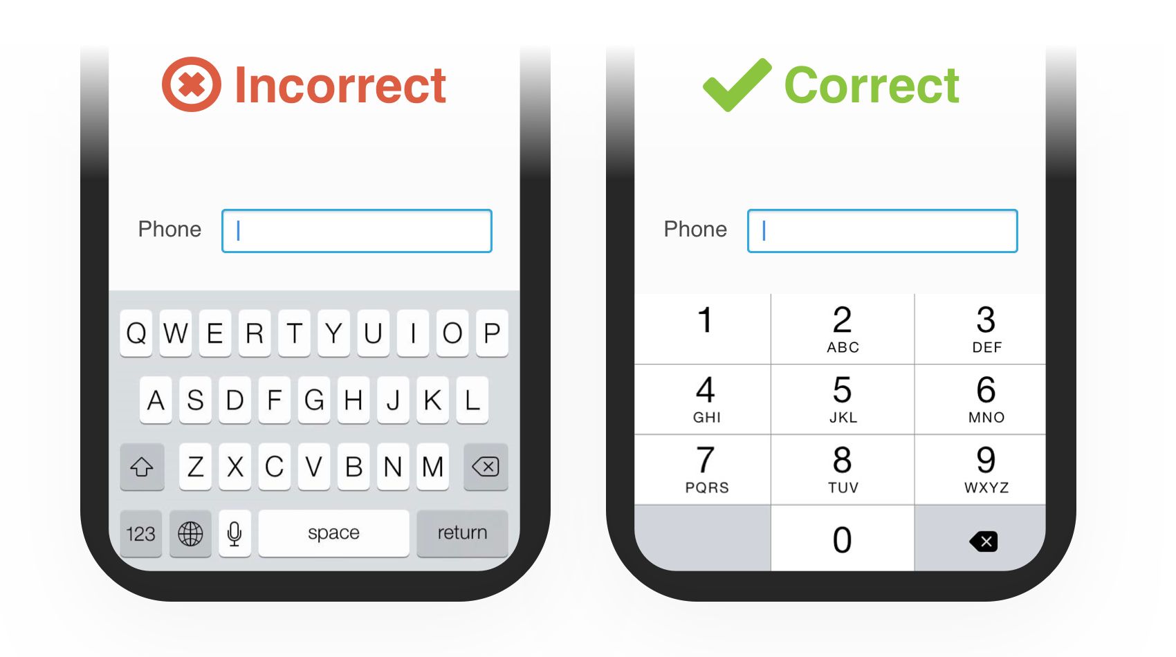
When they’re entering a number field, display a number pad. Full keyboards are clunky, and make it harder to enter information quickly.
Conclusion
Your checkout design can have a surprising impact on your website conversion rates.
In fact, the average checkout can see a 35.26% increase in conversion rate through better checkout design (The Baymard Institute).
At Xola, we understand the impact it can have on your business by decreasing booking abandonment and increasing your online revenue.
If you have questions about how you can improve your checkout design and boost your revenue, contact us at join@xola.com, call us at +1 (855) 909-9652, or request a demo online. We would love to help!