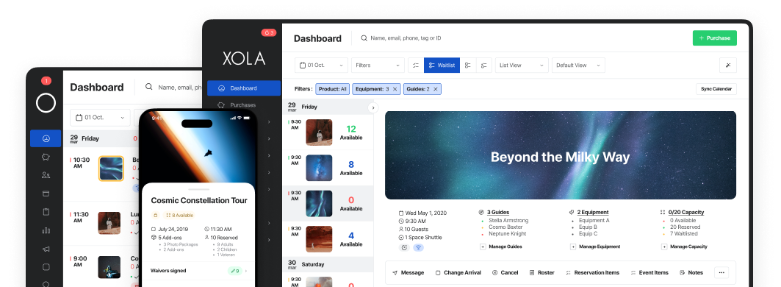
Thanks to our guest contributor, Andrea Appin from TourismTiger! Run by people with a love for adventure and a deep knowledge of the tourism industry, Tourism Tiger knows what it takes to build a beautiful website for your tour or activity company.
Tips for tour & activity businesses
As an avid internet user and online marketer, bad website practices are enough to make me scream. For your tour company, however, a lackluster website is as grave as a cardinal sin.
Your website is the linchpin to your sales. In many cases, it’s your business’s first impression. Bad website practices will lead to a reduction in user engagement, click-through rates and ultimately, revenue.
Lucky for you, this guide will keep your website in top shape and maximize your online sales. From #10 to #1, here are the most important features of tour operator websites:
#10: Make it credible
When someone lands on an unprofessional-looking website, what are the chances they’ll make a purchase? Low–very low.
Successful tour and activity websites gain a person’s trust right off the bat. In turn, this person engages more deeply with the company’s brand and is more likely to book a tour.
Here are a couple ways to enhance your online reputation:
Do you have an “About us” page?
The tours and activities industry runs on relationships and you need to convey your personality as much online as in person. Whether you’re an expert with years of business experience, or a new-comer with a fresh twist on a fun experience, let your strong suits shine through!
Keep your site up-to-date.
I know you’re busy. You and your staff have your plates piled high at all times. But whatever you do, don’t let your online presence grow stale. That applies not just to your website, but also your social media accounts. People will start to second-guess you if they see digital cobwebs forming. Whether it’s posting new content or refreshing your designs based on the newest best practices, your visitors will appreciate it.
Convincing your customers is only half of the battle, though. Google cares just as much, if not more, about your credibility. It has notoriously castigated sites that once exploited tactics like keyword-stuffing and backlinking at the expense of truly valuable content and expertise.
Generate more sales and rise through the SEO rankings faster with a credible site.
Need more ideas? Here are ten guidelines to help boost your website’s credibility.
#9: Layer on some peer pressure
No matter how you look at it, people are influenced by others.
As a tour business owner, you want to capitalize on this behavior — especially when it comes to your website. It’ll help you convert those viewers who are passively poking around into tangible sales.
Leverage social proof by displaying pictures of real customers having fun or by featuring any awards or recognition that your company has received.
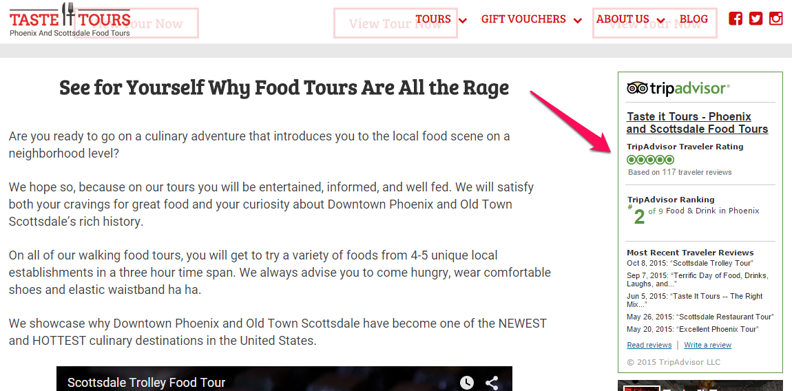
By by far, outstanding reviews are my favorite feature on any tour or activity website. If your tour earns high marks on sites like TripAdvisor, Yelp, or Google+, show it off. You can embed review widgets on your site so visitors can read what others have written without leaving your site. Badges of excellence also let people know you mean business.
We did this while designing Taste It Tours’s site to transform any hesitation into sure-fire yeses.
#8: No one likes a stale blog
Many people harp on about the importance of blogging. We say, think about it.
Blogging requires a lot of valuable time and resources. To run a successful blog, you need to know exactly what kind of content your audience would be interested in. You’ll also need to know how they’ll come across your blog (compiling a hefty list of subscribers takes a while, getting a high SEO ranking takes even longer.)
All this unfortunately means that it will take a long while before you’ll start reaping any rewards from your posts–if you ever do, that is.
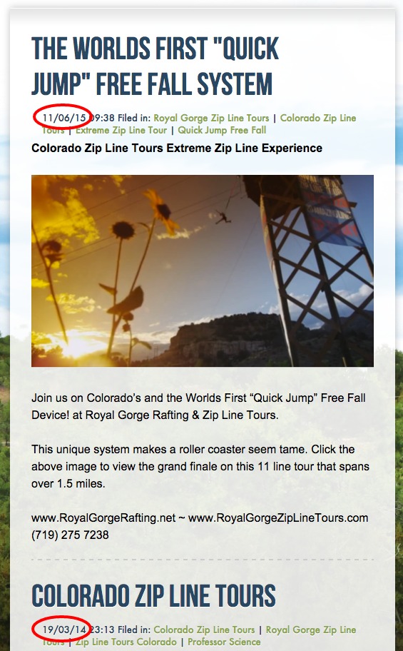
And once you start, if you don’t continue populating your blog with relevant and up-to-date posts, you could actually hinder the credibility of your website.
So should you blog? Only if you have a well thought-out plan that you can confidently execute.
#7: Use images that inspire
According to a recent study, viewers spend an average of 15 seconds on any given website. That means you have 15 seconds to make them stay. Are they going to spend that time reading long and tedious copy? Probably not. They’re looking for gripping imagery.
When it comes to imagery, there are two crucial elements to keep in mind:
- What kind of pictures to present
- Where to place them on your website
Any pictures you include on your site will appeal to the reader’s emotions. If the person captured in the picture is experiencing joy and a sense of excitement, then viewers will be able to envision themselves experiencing similar emotions on your tour.
Pro Tip: the sunnier and brighter the picture, the better. If the picture is taken on a sunny day, the viewer will envision herself taking your tour in the sunshine — and they will experience all of those positive emotions that come with that weather.
While working with Jaco Tours, we designed a website that included images that would speak to their target audience — people who are seeking adventure in an idyllic location.
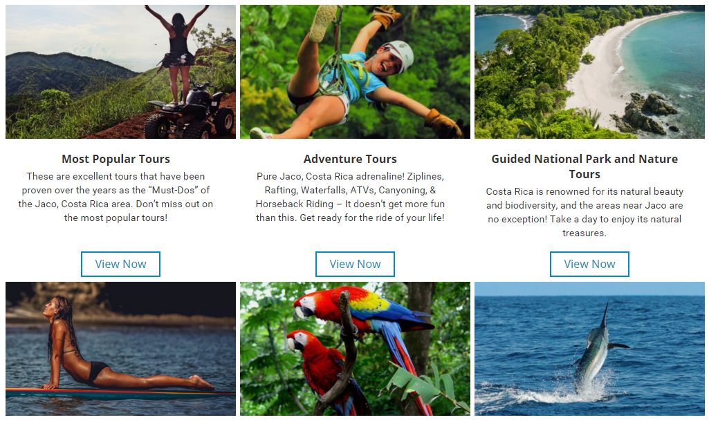
And their feature image, of course, was taken on a picture-perfect day:
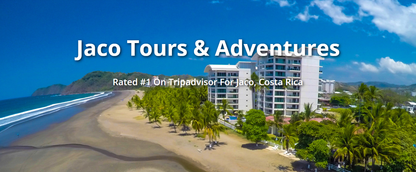
It’s no coincidence that we placed this pictures high up on the page, either. As you remember, the viewer isn’t going to spend time scrolling through the website. Pictures that ‘sell’ your tour should be seen within seconds of loading your website.
#6: Optimize for speed
All those big, glossy images are great sales assets, but use them wisely. Too many could bog down another crucial part of your website: loading times.
Loading times affect your bottom line. This infographic from Kissmetrics finds that as little as a one second delay in page speed could cause a 7% reduction in conversions.
That may not sound like much, but consider this: if you generate $10,000 in online sales per week, that pesky second will cost you over $36,000 in revenue per year.
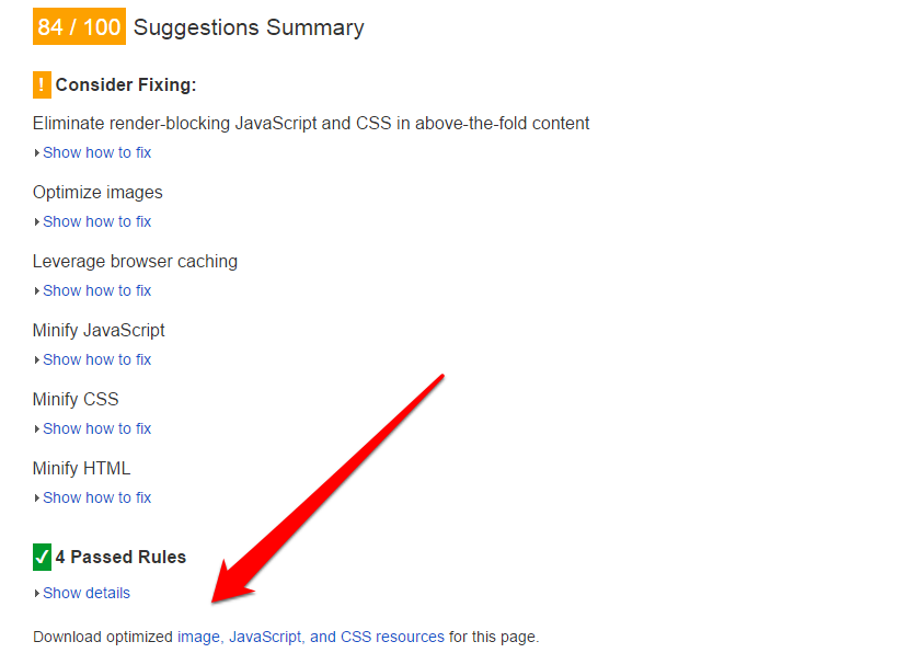
To determine whether you’re a victim of this kind of hemorrhaging, use Google’s PageSpeed Insights. It gives you a score of between 0 – 100, analyzing your website’s performance across platforms on two main aspects: “time to above-the-fold load” (what a user sees before they have to scroll down) and “time to full page load.” The higher the score, the better, both for your users’ web experiences and your SEO ranking.
Along with your score, Google will give you insights about how to improve your page’s speed. As a general rule of thumb, keep these points in mind:
- Optimize your website across all platforms (more on this in #5)
- Exercise restraint when adding widgets: Keep the ones that will trigger purchase decisions, like TripAdvisor reviews. Your Twitter feed, on the other hand, may not compel potential customers as much and could hamper your website performance overall.
- Use efficient HTML/CSS code: Make sure that your site’s main content loads faster than the widgets you’ve opted to use. Enabling compression can significantly reduce factors like loading time and data usage.
- Download pictures for your site directly through PageSpeed Insights: Google will even rewards all your “hard work” with an extra 15 to 20 points on your score!
#5: Invest in responsive designs
Not only should your website be fast, but it should also work seamlessly across all platforms– no matter how large or small the screen is.
That’s where responsive design comes in. A responsive site automatically reconfigures itself based on the user’s screen size.
This type of design has become instrumental with the exponential rise of mobile searches and bookings. Approximately half of online bookings come from a smartphone or tablet.
If you’re looking to torch 50% of your online revenue, then by all means, stick with an unresponsive site like the one on the left. Don’t count on too many people screen-pinching and scrolling their ways through your website to book a tour.
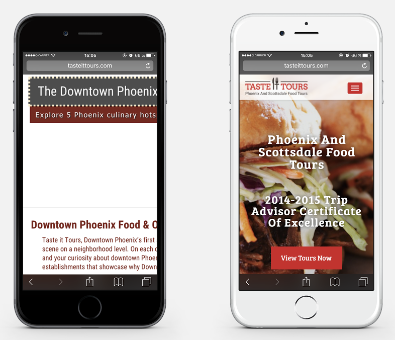
By comparison, the picture on the right showcases a responsive layout. All the content fits perfectly within the boundaries of a mobile screen, making it easy for users to book a tour.
#4: Befriend Google Analytics
While Google Analytics may seem beastly to the untrained eye, those that put in the time and effort to master it will reap serious benefits.
There’s certainly a lot to be learned in GA, but I’ll help you get started with its three main branches:
- Audience: Reports in this category tell you who’s coming to your site: where they live, what language they speak, what kind of platform they are using to access your website and how much time they spend browsing around.
- Acquisition: How do people find your site? These reports break down organic search, referral, direct (URL entered) and social metrics. If you use email marketing, any traffic generated from your newsletters will be included here as well.
- Behavior: This category analyzes every individual page on your website. Go here to see which pages on your website get the most traffic and which ones go unnoticed. Pay attention to your top landing pages, exit pages, and bounce rates.
If you rely on online marketing at all, get to know and use this super powerful and completely free tool.
#3: Walk a mile in your visitors’ shoes
As a tour operator, you want to convert anyone viewing your website into a paying customer. Although you might offer up great tours, there’s a chance that viewers might not take part in these tours simply because they don’t know how to navigate your site.
Free tools like Hotjar will help you determine whether people are getting stumped on your website. Hotjar and other heat maps show you how users interact with your pages.
Really, it’s invaluable business intelligence that could make or break your online sales. By analyzing user interactions, you can identify key areas of interest on your website that you should emphasize more, as well as points of confusion that you should remedy.
Ultimately, though, the best bang for your buck (and your time) is to invest invest in a web layout designed to decrease confusion and increase conversion rates.
When you combine an expertly-designed website (like this one we made for Taste It Tours) with Hotjar’s insights, you’ll boost your online sales and learn more about your customers’ web experiences.
#2: Drive more clicks and less confusion
So you’re using Hotjar and you discover that people are having more trouble navigating your site and booking tours than you had hoped. Better calls-to-actions (CTAs) could offer users more structure and encourage revenue-generating behavior.
Usually CTAs look like buttons and invite visitors to perform an action like “Book now,” or “Sign up for our mailing list.”
CTAs directly correlate to your business goals, so naturally, it’s imperative that people click them. But whether they do depends largely on your CTA designs.
Start with the text. You want it to be short and straight to the point. It should start with an action verb (get, reserve, book, etc.), and that verb should accurately represent what happens when the person clicks the button.
Secondly, the color of the CTA should stand out from your page. See what a difference the right color makes on this tour operator’s website.
One last piece of advice, make sure that you place your “Book Now” button above the fold. That, after all, is the most important action you could encourage on your website, so lead with it.
An even better option is to craft a “sticky” CTA like we did for Jaco Canyoning. It follows the user no matter where she scrolls on the page.
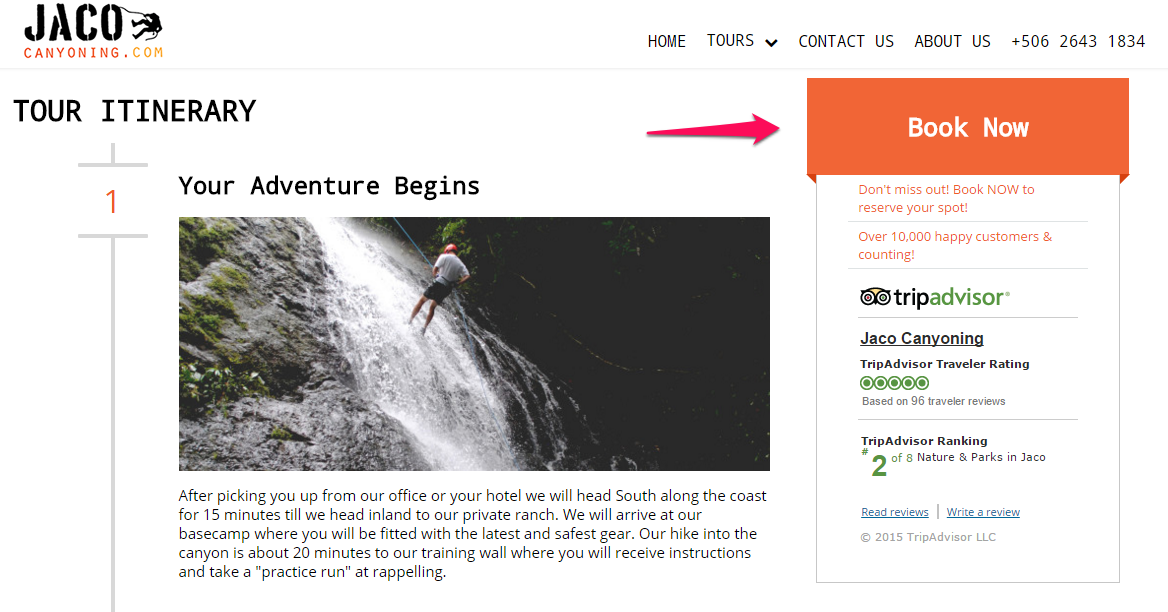
CTAs are like signposts telling people to stop at an intersection or take the next exit. Imagine what driving would be like without these visual cues and then you’ll realize how valuable CTAs are on your website.
But by putting thought into the content and design of your website’s CTAs, you can minimize users’ confusion and maximize their bookings.
#1: Integrate with online booking software
You’ve put all this effort into nailing the user experience of your website but there’s still one thing standing between you and your next customer: your online checkout.
With a sleek, professionally-designed booking system, however, all your hard work will come to fruition with a seamless checkout to match your website.
Since drop-off increases with each additional checkout field, don’t require any information that isn’t essential before the transaction is complete. More steps in your checkout means fewer customers for your business.
Xola’s booking and marketing software takes these principles to heart in its online checkout.
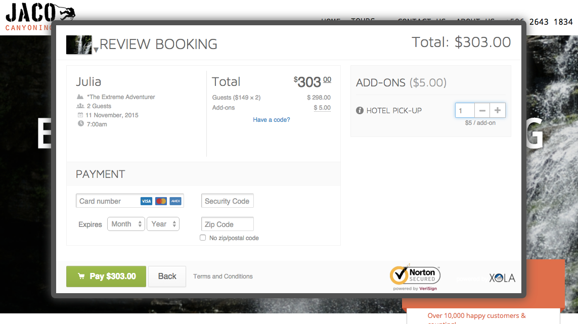
All in all, the booking process spans two screens and only asks for the essentials: number of guests, date and time, name, email address, and credit card information. We even timed it: booked in 35 seconds flat.
Seriously folks, nearly 40% of travelers book their tours online. Make sure your checkout isn’t sabotaging what should otherwise be easy money for your business.
Keys to success
Before you put anymore time into social media, advertising, or whatever else is on your marketing plate, take a hard look at your website. It’s the single-biggest influencer and revenue-generator out of all of your marketing efforts.
Follow the ten tips in this guide and you’ll be on your way to a wildly successful website.


