

Online Calls-to-Action
They come in all shapes, colors, sizes, and fonts. The same action can be communicated in millions of ways. In short, designing the right calls-to-action is both an art and a science. Nail the CTA and selling tours online will be that much easier.
There are two important things to consider when designing calls-to-action: style, and content.
Style can mean a lot of things, but for now lets focus on color. I’ve read my fair share of articles professing what new hue is the end-all-be-all color for converting the most visitors. But in reality, there is no silver bullet…or green bullet, or red bullet, or blue bullet. Color does matter when it comes to conversions, but no single color will work in all circumstances.
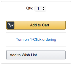
There are two CTAs in the above example. Notice anything about the color of these two buttons? The important one, the one that initiates the actual purchasing process, is yellow. Yellow stands out against the white background.
The “Add to Wish List” button on the other hand, is white. It blends in with its surroundings. Why? Because Amazon, the vendor in this case, wants people to add things to their cart, not add things to their wish list, which they may or may not buy later.
Now, let’s apply this to tour operators.
Calls-to-Action on Tour Websites
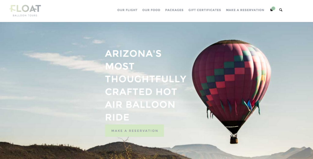
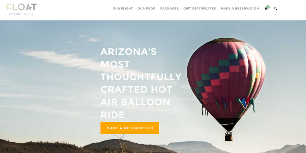
What do you think when you see this site? (Here’s a link if you want to see it in action.) It’s beautiful, no doubt, with a stunning image that pleases the eye. Can you spot the CTA, though? It’s right there, under the large, white writing.
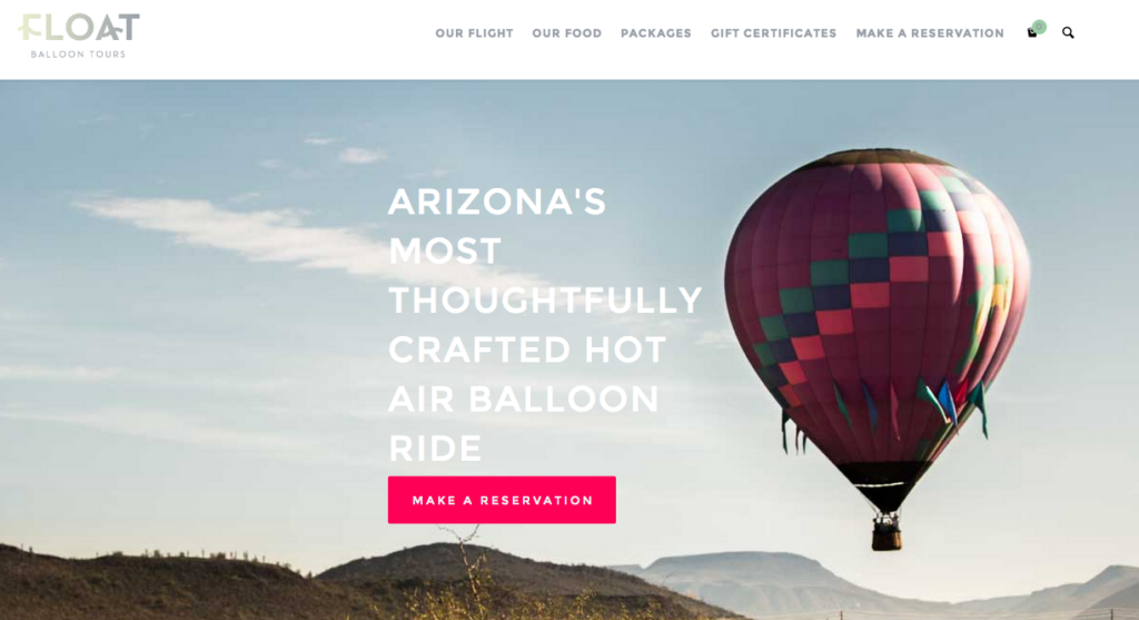
The light green blends in with the light blue background of the picture, however, making it the call-to-action less effective. I would argue that this tour provider would do better with a bolder call to action. Consider something like this:
In this case, the golden-yellow makes a statement against the lighter backdrop. This color also remains within the theme, as it is used on other pages in the website.
Here’s a second example using another bright color in this site’s palette.
Both the pinkish-red and the golden-yellow buttons stand out more than the original mint CTA.
Now, deciding on the optimal hue might simply be a question of preference. There are plenty of articles out there that go into the psychology of color choices, such as the idea that redder tones connote “stop” and therefore get people to pay attention.
Yet, the examples above show how both the pinkish-red and the golden-yellow both stand in stark contrast to the light blue background of the picture. More than trying to psychoanalyze the meaning of all the colors in the rainbow, here’s what you should remember:
Rule #1: Although there is not one, foolproof, CTA color, one thing is certain: The color of your CTA must stand out from your background.
The second, crucial thing to consider when designing calls-to-action is to ask yourself what action you want people to take. Do you want them to reserve a spot, get their reservation, book a tour, buy now, or something else?
There are many ways to say essentially the same thing. Perhaps you might want to test different CTAs and see which one converts the best.
One thing’s for sure, your calls-to-action are no place to write the next “Great American Novel.” There’s not a word-limit per se, but time is always of the essence when you’re getting someone to take action online. The fewer barriers, the better. So what does this mean?
Rule #2: A CTA should succinctly and clearly communicate the action that will follow.
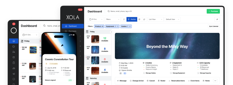
At Xola, we take all of this advice to heart when we design CTAs for our clients. We use bright green “Book Now” buttons. When you’re working with a variety of verticals and website templates, this color and text cuts across most designs and/or business-types.
Not too many people have neon green backgrounds on their site, and “Book Now” clearly conveys that people can purchase a tour or experience immediately. Thus, the color stands out and the text tells people exactly what they should do next, while adding an element of urgency to the purchase.
Your Next Steps
Your online presence is essential in today’s digital world. If you want to give your site a boost this off-season, start by evaluating your calls-to-action. Do they stand out? Do they clearly communicate what a customer should do?
If your booking software puts buttons on your site, is the company open to helping you find the right design for your site? If not, why?
Your booking software should be a partner and advisor on questions like this that could seriously impact your business. You should be able to trust them with what’s in your best interest.
Like I said before, calls-to-action are the one thing standing between you and a customer. If they’re not spot on, you could be undermining your online revenue potential.
When you have some time, give some thought to how your designs help or hurt your goals. It can be fun too, when you start to play around with it. Happy designing!