

Your website’s activity pages are where consumers go to make the crucial decision of whether or not they make a booking.
The activity page is 1 of 3 critical pages that make up the “path to booking” – the most common route visitors take when making booking decisions on tour and activity websites.
Activity pages provide consumers with critical information about your offerings, like descriptions, photos, technical details, locations, directions, and more.
That’s a lot of information. But many people won’t make a booking without it.
There are two key aspects to building activity pages that generate more bookings:
-
- Provide engaging and easily understood information about your activity, and
- Make it easy for website visitors to start the checkout process.
Here are five simple improvements you can make to optimize your activity pages and get more bookings on your website…
1. Write an Engaging Activity Description
Activity descriptions are meant to intrigue and inform.
Captivating copy grabs vsitors’ attention and guarantees they stay interested in your offering (and stay on your site). Including vital information, such as safety restrictions and crucial requirement, helps visitors understand what to expect and decide if they want to book that activity.
How to Optimize Your Activity Description
Tell a Story
Storytelling is deeply human. Stories actually alter our brains and can change the way we think and act.
The data backs it up too.
A study of 3,000 consumers, conducted by Hill Holiday’s research division Origin, found that product pages that contained a story generated up to 11% more revenue than product pages with “standard” descriptions.

Don’t settle for a bland description of your offering. Instead, engage your visitors with a story. Draw a real emotional connection and help them imagine what it’d be like to experience you offering.
Take these examples from two Escape Room businesses. Which activity would you want to book?

Be Action-Oriented
Great stories are driven by great action.
Put the visitor in the center of that action. Describe exactly what it feels like to experience your offering. Action-oriented storytelling help visitors make a real emotional connection and encourage more bookings.
2. Give Them the Details
Where the activity description is meant to intrigue, the activity details are meant to inform.
Activity details are extra pieces of information that cover the technical details and requirements of your offering. Meeting locations, directions, and information about what’s included and what to bring are great examples of useful activity details.
Adding important instructions and technical details help detail-oriented customers plan ahead. It is your chance to answer important questions like “what should I bring?” or “where do we meet our guide?”
Pre-empting customer concerns (e.g. safety concerns, refund policies, late arrival instructions, etc.) helps reduce anxiety and improve the person’s confidence in booking with you.
How to Optimize Your Activity Details
Keep It Short but Informative
Technical information is tedious to read. Your visitors will quickly skip important requirements if the text is too long or difficult.
Keep details and requirements short and simple. Focus on the most important points and links to other pages for in-depth documents like your terms of service (TOS) agreement.
Organize for Clarity
Our brains prefer information that is organized and decluttered.
Categorize your activity details by clustering similar information in sections like “What’s Included” and “What To Bring.” Make the information easy to digest by using lists or bullets.

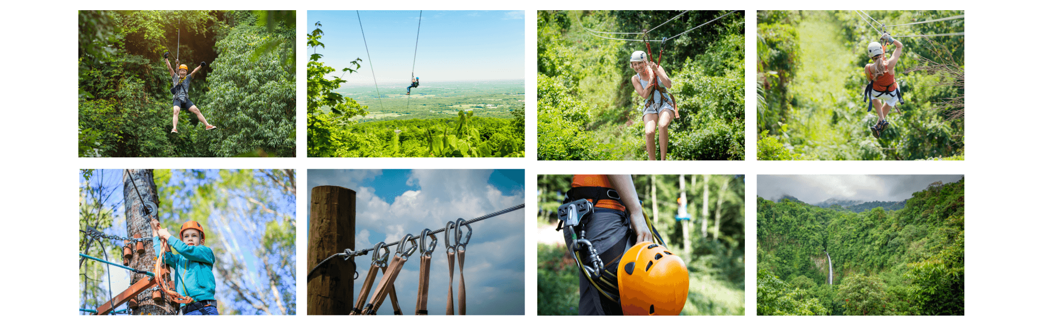
3. Add a Photo Gallery
Photos allow visitors to envision the experiences you offer in a way that text cannot.
Imagery has a powerful effect on people. It creates excitement and strong emotional reactions. It helps visitors feel, if just for a moment, like they’re really there, experiencing your activity.
“The purpose of the text, the video and the photos on your site is to help you sell more tours. Photos that help you sell are great. The best photos are of great quality… showing people having a great time in a great place.”
– Matthew Newton, TourismTiger
How to Optimize Your Photo Gallery
Focus on Image Quality
Low quality or amateur photos lower the perceived quality of your offerings. On the other hand, using overly stylized or stock photos give visitors the impression that they’re being misled.
Try to display professional but natural looking photos and videos for the right balance of quality and realism.
Show Every Angle
Because a gallery allows you to show a variety of photos, it’s a good opportunity to showcase many different facets of your offering, both big and small.
Unlike photos on your homepage, the activity page gallery should highlight all of the different aspects of your offering. Show a dynamic range of photos: people, landscapes, safety equipment, and whatever else might inform or intrigue your visitors.
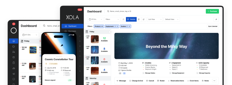
4. Give a Clear Call to Action
A clear “Book Now” button on your activity pages increases the likelihood that visitors become paying customers.
Think of it this way, if they don’t click because there is no call to action or clear ask, they won’t book.

TourismTiger designed a clever call to action for Everyday California’s pages. The button sticks with you as you scroll, and the review module helps reinforce the positive message.
How to Optimize Your Call to Action
Keep It Above the Fold
Keep your call to action “above the fold” (i.e. high enough on the webpage that people can see it without having to scroll down). This ensures that all of your site visitors see your call to action, increasing the likelihood that they click on it and make a booking.
Make It Sticky
A sticky, or fixed-position “Book Now” button is a button that stays locked in place so that it does not disappear from view when your visitors scroll down the page.
Sticky buttons make the path to booking simple and straightforward, no matter where you are on the page. When your visitors are ready to book the button will be right there in front of them.
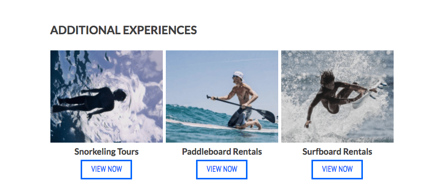
5. Promote Other Activities
Some people who visit your activity pages are not there to make a booking.
Visitors that are early in the booking cycle are interested in doing research and discovering new offerings.
Promoting your other, related activities helps visitors research and discover the breadth of activities that you offer. By facilitating your visitors’ discovery process you are psychologically pushing them further through the buying cycle and priming them to book with you.
How to Optimize Your Related Activities
Don’t Hog the Spotlight
Highlight your related offerings at the bottom of each activity page. Keeping it at the bottom ensures that your visitors don’t get distracted from their main task (researching the specific activity showcased on that page to decide if they will book it) until they are done with that page.
Conclusion
Activity pages have to be clear, but engaging. People visit these pages to better understand your offerings and make important decisions about whether or not they will make a booking.
An engaging description, clear and organized details, and captivating images will help tip their decision in the direction of booking with you.
Once a visitor has committed to booking your activity, it is important to provide them with a clear and simple way for to choose their booking details (quantity, date, and time) and make their online payment.
A clear call to action that leads to a simple, distraction-free checkout will result in more consumers completing the booking process, meaning more online revenue for you.
Finally, it’s important to consider the visitors who are not ready to make a booking (at least not yet). Try directing them to your other offerings by promoting related activities at the bottom of your activity pages. This will increase the likelihood that they continue to explore your offerings and don’t leave your website too soon.
That’s it for our second installment of our Conversion Science blog series. In the first installment, we discussed 5 ways to optimize your website’s homepage. We hope you join us next week for proven tips on how to optimize your online checkout for more bookings.