

Think about every time a guest purchases a ticket or makes a booking on your website. Your website analytics give you a glimpse into what influenced their purchase. And every time you send a customer satisfaction survey to learn more about a guest’s visit, their feedback can help improve your guest experience.
Business intelligence reporting is the process through which your company uses software and tools to extract relevant insights from this data.
Your BI reporting might involve static reports that you send to your team, or a customizable dashboard that updates in real time.
In this post, you’ll learn the difference between the two — as well as the 5 types of business intelligence reports that can help you run your company more effectively.
What is a business intelligence report?
BI Reports vs. Dashboards: Which one to use?
What is a business intelligence report?
Customer data is what moves your company forward: It informs your hiring decisions, molds your marketing campaigns, and helps you provide guests with the best experience possible. Yet if this data is never analyzed, there’s no use in collecting it.
A key aspect of BI reporting is sharing actionable insights with other members of your team.
BI reports allow you to do that. The goal behind a BI report is to neatly package those insights into an easily accessible report that will be used to make relevant decisions, whether it be about investing in more equipment or improving the guest experience.
These reports are typically static and drill in on a specific area of your business. They’ll start with a summary of the main focus of the report and include key takeaways based on real data.
Reports make it possible for your attraction to spot meaningful customer trends and have a better understanding of business operations.
Different reports can be generated for different departments. When everyone has access to data that helps them perform their job better, the company as a whole wins.
BI Reports vs. Dashboards: Which one to use?
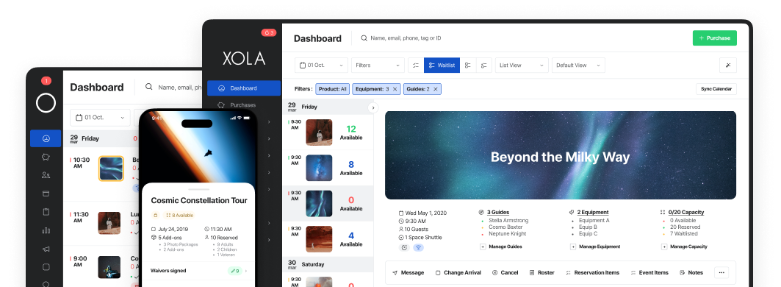
BI reporting can come in different forms. A BI dashboard is a visual display of relevant data points on a single screen.
A dashboard makes use of charts, graphs, and maps to portray this data in a way that’s easy to read and understand at a glance.
You can typically monitor data like sales volume, bookings, and more in real-time. Your attraction can then quickly spot issues that need your immediate attention.
Dashboards also make it easier to share information with your team. When your employees have access to your BI dashboard, they can interact with the data themselves and even create custom dashboards based on the data that’s most relevant to their department.
An attraction might use a dashboard to monitor day-to-day operations and create a BI report to share detailed insights with its team.
A report displays relevant insights from the data collected in a dashboard. It can drill down on trends and explain what they mean for the group of employees receiving it. Reports also typically offer recommended actions based on the data collected.
BI reports can be lengthy and span multiple pages. It can include charts, graphs and other visual elements along with written descriptions of each.
While a dashboard might show you how your booking volume is progressing throughout the day, a report can shed light on your guests’ purchasing preferences.
Businesses typically use both BI reports and dashboards to collect and share data with its employees.
Types of BI Dashboards
There are a few different types of BI dashboards available, and each offers a different approach to tracking data. The one you choose will depend on your main business objectives and who will be using the dashboard.
Regardless of the type of BI dashboard your attraction uses, there are three key factors to look for, according to Tableau:
- Intuitive user experience. Everyone on your team should be able to easily use the dashboard.
- Customizable dashboard. The platform should allow users to visually customize their dashboard based on the KPIs they’re looking for.
- Room to grow. The dashboard should be flexible enough to grow with your business.
Operational Dashboard
Operational dashboards shed light on what is currently happening at your attraction. It monitors data in real-time, meaning it’s updated very frequently.
Managers and their teams will use this dashboard to assist them in their day-to-day workflow.
An attraction might use an operational dashboard to track website analytics like new users and conversions. You could also use it to track customer service KPIs like the number of phone calls and your average response time.
Strategic Dashboard
A strategic dashboard is typically used by business owners and top executives to track key performance indicators, such as monthly, quarterly, or yearly financial goals, including revenue and profit.
Strategic dashboards help a business stay on top of these key metrics, often summarizing performance over set time frames.
An attraction might use this kind of dashboard to track its quarterly booking volume, which helps it make marketing and hiring decisions for the next quarter.
Analytical Dashboard
Analytic dashboards can process large amounts of data to gain deeper insights into your attraction’s performance. More specifically, the dashboard can discover trends, predict outcomes, and establish goals based on historical data.
These dashboards are more complex and tend to be used primarily by business analysts.
An attraction could use an analytical dashboard to spot trends in customer satisfaction over time, such as NPS scores and customer retention. In an analytical dashboard, you can play around with different data sets and KPIs to determine the root causes behind things like a dip in customer satisfaction.
BI Report Types
BI reports can come in various shapes and forms. They can come in table or spreadsheet format, as well as a PDF. Some reports, such as the ones available on the Xola platform, are customizable to what you’re trying to measure.
Let’s take a look at a few of the different BI reports you’d have access to on the Xola platform.
Capacity Utilization Report
The Capacity Utilization Report shows you the booking capacity for specific listings over time.
For example, this report can show you which of your listings were booked at or above 75% capacity. It can also highlight listings that are under capacity.
This information can help you understand your most and least profitable tours and time slots. You’ll then be better equipped to make staffing decisions or schedule adjustments based on real data.
Earnings Report
Xola’s Earnings Report is a breakdown of daily transactions.
If you wanted to find out how much revenue came in from bookings on a specific date, you’d look at the earnings report for that date.
The earnings report shouldn’t be used to account for the overall revenue for your business, but rather to track sales for a specific day.
Bookings Report
Your Bookings Report will show you everything you need to know about existing bookings. This includes quantity booked, booking date, add-on purchases, and guest name.
In Xola, you can view your bookings for any date range. You can then export it into a spreadsheet for your convenience.
Attractions can refer back to their booking reports to keep track of booking volume and guest information.
Customer Report
The Customer Report gives you a summary of how many guests booked or purchased tickets over a specific period of time.
You can break the information down by guest demographics and the listing they chose.
You can use the Customer Report to track trends in customer volume across product offerings and seasons.
XolaBot Earnings Report
The XolaBot Earnings Report breaks down the revenue impact of Xola’s automated marketing and sales assistant.
The XolaBot fully integrates into your website and engages with your guests along various points of the customer journey, from pre-purchase and customer discovery to point of purchase and post-sale.
This report shows the booking volume and earnings you’ve made from your XolaBot campaigns.
***
Operating without BI reports and/or dashboards is like running a business in the dark.
Xola can give you access to these valuable BI reports and more with its all-in-one booking and marketing software.