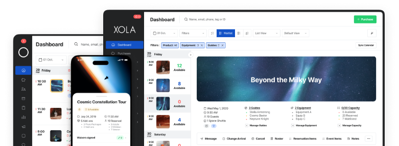


If you’ve ever felt frustrated by the number of abandoned bookings on your website, you’re not alone.
Conversion rates can be quite low for travel websites, but that doesn’t mean there aren’t ways to improve your own.
There are many reasons why guests don’t follow through with a booking, but the checkout process is easily the most important. When guests arrive at the final stage of your online booking flow, there should be nothing holding them back from finalizing their purchase.
The key here is to put yourself in your customers’ shoes and focus on the user experience. Why would anyone abandon a booking at the very last moment?
In this post, we’ll learn about 12 UX checkout best practices that will make the booking process a breeze for your guests — ensuring they make it to the finish line.
- Show the total cost as soon as possible
- Allow guest checkout
- Reduce the number of form fields and make them easy to fill out
- Provide a process bar for the checkout process
- Offer live chat support
- Show real-time availability
- Optimize your mobile checkout
- Make it easy for them to pay
- Add a line for a promo code
- Redirect customers to a thank you / success page
What makes a great checkout page?
When a customer arrives at your checkout page, they’re in the best possible position to convert. They’ve landed on your site, browsed through your tour pages, and decided to book with you over all the other activity operators they came across. This is an exciting moment for them: They’re booking an experience they’re really looking forward to!
Yet, about 80% of people will still abandon a travel booking even after they’ve made it to this stage. While some people abandon a booking to do more research, many cite a complicated checkout, technical issues, and lack of payment options as reasons for leaving.
A great checkout page tackles these issues by:
- Simplifying the checkout process: Customers should be able to check out in just a few steps after choosing the date and time of their booking.
- Eliminating friction: Customers should be able to easily share their personal information by checking out as a “guest.” No one wants to spend the extra time to create an account when they’re simply trying to book an experience.
- Make it easy to pay you. Guests may have their credit card information saved on their desktops or prefer to checkout via PayPal for security reasons. Either way, the convenience to pay with their preferred method removes the hassle of needing to reach for another credit card or signing in to another e-payment platform.
Why should you optimize your checkout?
Optimizing your checkout helps you make more sales. Moreso, a well-designed and organized checkout leaves a positive impression on your guests. Meanwhile, a messy page can quickly make them uncomfortable and drive them to your competitors.
What’s a good conversion rate?
Your website’s conversion rate measures the percentage of visitors that make a booking after landing on your website. The higher your conversion rate, the more revenue your company is pulling in.
Let’s take a look at conversion rate benchmarks for the travel industry:
- The average conversion rate for all eCommerce businesses across all industries was around 1.6% as of August 2022
- Within travel, the average conversion rate ranges from 0.2% to 4%
- Airlines convert at a rate of 5% to 10%
- Hotels are converting 1.5% to 2.5% of their customers
12 checkout UX best practices to get more bookings
Here you’ll find 12 tips to improve your checkout process — one of the top factors that drive guests away.
1. Show the total cost as soon as possible
Pricing is a key motivator when it comes to booking travel. Many people don’t mind browsing the internet for days in search of the best travel deal. So it shouldn’t surprise you that 37% of travelers abandon a booking because the cost was too high, and they want to compare it with other offers.
The tip here is to be as transparent about costs as possible.
No one wants to arrive at the payment stage only to find a series of hidden fees and taxes tacked onto the final price. When your guests understand the full cost of their booking upfront, there won’t be any surprises waiting for them at the end of the checkout process.
2. Allow guest checkout

Allow your customers to breeze through the checkout process without having to make an account. If you don’t, you might risk losing up to a quarter of your customers.
Having to create an account — which involves filling in more form fields and sharing more personal information than necessary for a booking — is just another hurdle to jump through. Remember that your checkout process should be a frictionless experience. Guests should be able to complete their checkout without having to complete any additional steps.
As you can see from the example above, Mint Julep Tours allows guests to quickly complete their booking without ever having to “Sign in” or create a guest account on the website.
More often than not, your customers aren’t ready to create an account with you before their booking. This could be their first experience with your brand, and while they’re excited about the booking, they’re not quite loyal fans of your brand just yet.
Rather than simply asking them to create an account upfront, wait for them to complete their booking. Then, you could offer them an incentive — such as a discount for future tours — to create an account either on the final success page or in a follow-up email.
3. Reduce the number of form fields and make them easy to fill out
When your customers finally arrive at your checkout page, they’ve already put in a lot of effort researching and planning this activity. Now, they’re expecting the final checkout process to be quick and painless.
Dozens of form fields can make your checkout process just the opposite. In fact, one too many form fields can overwhelm your customers and tempt them to abandon the booking.

To keep your form fields at a minimum, consider only asking for the most essential information, including name, billing address, and payment information.
Whether there are three form fields or 10, aim to make them as easy to fill out as possible.
One tip is to use relevant input fields. For example, providing guests with a calendar rather than making them type out “January 15, 2023,” as shown in HeliNY’s checkout page above. Another is the address finder, which will suggest an address and auto-fill several lines after the user types in a few letters.

Enabling the auto-fill feature for names and phone numbers is also helpful. And when a customer switches from the “name” field to the “phone number” field, make sure the right keyboard comes along with it. A quick tweak to your HTML code can ensure that the number keyboard pops up when guests click into the “phone number” slot, as seen in Xola’s checkout example above.
4. Provide a process bar for the checkout process

Booking a tour online might seem like a simple task. But for someone who doesn’t book travel-related activities or tours frequently, a lengthy booking process can feel overwhelming.
This is why incorporating a progress indicator is one of the best ways to ease checkout anxiety. As you can see from the checkout page for Dylans Tours in San Francisco, guests instantly know there are only three steps in the process. They realize how close they are to be done as soon as they start the checkout, giving them more of an incentive to follow through.
5. Offer live chat support
Chatbots act as 24/7 automated support on your website, answering customer questions while you focus on other more important aspects of your business. When a guest has a question, they’ll receive a response almost immediately. And if their request goes beyond the chatbot’s capacity, someone from your team can offer live chat support. Tour operators should strive to personalize responses to keep guests engaged, and keep track of the most frequently asked questions to address them ahead of time.
6. Show real-time availability
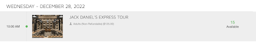
Imagine the frustration of a guest that reaches the end of the checkout process only to realize the date and time they requested isn’t available.
This scenario can be avoided by providing guests with real-time availability upfront. Mint Julep Tours, for example, shows the number of spots available on any given tour. If a party of 4 wants to book a tour, it knows to choose the time slot with enough spaces available.
7. Optimize your mobile checkout

About 48% of travelers are comfortable planning and booking an entire trip on their mobile phones. As your customers become more comfortable booking activities on their phones, they’re going to expect tour operators to greet them with easy-to-navigate mobile checkouts.
A great mobile checkout experience takes into account the limitations of mobile devices — namely, the small mobile screen that makes it difficult to navigate a site and switch between browsers.
Aside from limiting the number of form fields in your checkout process, you want to try to fit them all on one screen. This not only eliminates the need for additional scrolling but also makes the checkout appear less cumbersome.
There are a few ways to do this. First, you can add labels like “name” and “email” directly into the fields, instead of above them. Second, you should remove “optional” fields and only keep the ones absolutely necessary. Finally, unite fields when possible. For example, ask for “first and last name” in one field, instead of splitting them in two.
It’s even more important to make your booking buttons stand out and to keep the checkout page as simple as possible. Also, the cleaner your checkout page, the better. As you can see from the Cycle Pub’s mobile checkout, the simple design looks great on a mobile screen. If it’s easy to lose a customer on a desktop, it’s even easier to lose them on a mobile device that pings with a new distraction every few minutes.
8. Make it easy for them to pay
Instead of making a customer reach for their wallet, allow them to quickly checkout with Apple Pat or Google Pay. This is especially relevant for customers booking on their phones.
Adding a split-payment option can also facilitate payment for groups. Split-payments allow the customer to pay for the booking in installments, or divide up the bill so that each member of the group pays for a portion of it.
9. Add a line for a promo code
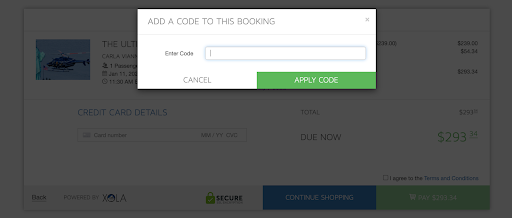
If your marketing strategy involves discount codes, you’ll need to make this field stand out in the payment stage. Make the discount field visible by placing it between the order details and the final call-to-action, as seen in the above example from HeliNY’s checkout page.
10. Redirect customers to a thank you / success page
When the booking is complete, redirect your customers to a success page where they can go over the details of their booking. This page should notify them that the order has been fully processed and that a confirmation email is heading to their inbox. At this point, you may also encourage your customer to create an account so that they can easily refer back to their booking details in the future.
***
In sum, the checkout phase can make or break a potential booking. These best practices are proven to polish your user experience and provide your customers with the breezy online booking they’re looking for.