

What if the only thing keeping you from doubling your booking conversion rate is a few tweaks to your checkout page?
A smooth checkout helps increase conversions and boost revenue — and with just a few improvements, you can start driving more bookings through your website.
In this post, we will discuss various tips that tour operators can use to create the best checkout pages. You’ll also find real examples of the best checkout pages from tour and activity operators for extra inspiration.
What is the best checkout process?
Why is the checkout experience so important?
13 tips to create a better checkout experience
- Make your book now buttons stand out
- Display a booking summary
- Allow guest checkout
- Make your checkout page mobile-friendly
- Provide more than one payment option
- Limit the number of form fields
- Offer chat support
- Eliminate any unnecessary elements at checkout
- Add trust signals
- Send abandoned cart emails
- Let guests know where they are in the checkout process
What is the best checkout process?
The best checkout process for tour and activity operators is one that is quick and painless. Customers should be able to easily book tours and activities for a specific date and time.
It’s important to offer a variety of payment options, including Apple Pay and Google Pay. Your entire booking process should also be transparent with no hidden surprises.
Finally, it should also be mobile-friendly, as many customers will be accessing the website and completing their purchases on their mobile devices.
Why is the checkout experience so important?
The checkout experience can make or break a booking. If the checkout page takes too long to load or if the payment page doesn’t make the buyer feel secure, the customer can quickly turn to a competitor.
Let’s take a look at the three main reasons why the checkout experience is so important:
- Conversion rate optimization: A well-designed checkout page makes it easier for customers to complete their purchases, which can help improve your conversion rate. If the checkout process is confusing or frustrating, customers may abandon their carts, leading to lost revenue.
- Customer satisfaction: A seamless checkout experience will improve customer satisfaction. When customers have a pleasant booking experience, their first meaningful interaction with your company is starting on a positive note. They are now more likely to have a positive experience, which can lead to repeat business and word-of-mouth referrals.
- Brand reputation: A poorly designed checkout page can make your brand look bad, especially if your customers start comparing it to your competitor. A negative checkout experience may cause customers to abandon your business altogether.
Overall, it’s important to get the checkout right to maximize bookings and customer satisfaction.
13 tips to create a better checkout experience
1. Make your book now buttons stand out

Your guests could easily miss the checkout button if it doesn’t jump out at them, especially on a small mobile screen. Operators should strive to make it easy for visitors to navigate their website, which means prominently placing the “Book now” buttons on your home page and making them stand out.
The same goes for when guests make it to the final checkout page. Make the final payment button stand out, giving them a clear path to booking.
Above you’ll see an example from HeliNY, a helicopter tour operator in NYC. HeliNY’s “Book Now” button is white so that it stands out from the dark background, making it easy for users to spot it. Here are a few tips to accomplish this on your website:
- Use different colors and fonts to make your buttons
- Make the button bigger and brighter than the rest of the text on the page
- Keep the button front and center
- Consider using the color green, which signifies “go!” and encourages your customers to take action
2. Display a booking summary

Guests likely want to double-check their booking details to ensure they’ve chosen the right date and time. It’s helpful to show them a short booking summary so they can feel confident enough to finalize the payment. The summary should include the date, time, and other key details of the experience. If you don’t provide one, your guests might return to a previous page and risk losing the progress they’ve already made.
As you can see from the example above, the tour operator Denver Adventures provides a detailed summary of each reservation, including the name of the tour, the date and time, the number of people, and the customer’s contact information. You can also achieve this by:
- Writing detailed tour descriptions and itineraries and sharing the most important pieces of information during the checkout process
- Highlight the date, time, and location of the experience
- Go the extra mile and provide additional information like what to bring
3. Allow guest checkout
About a quarter of online shoppers abandon their cart when a website asks them to create an account during checkout. Creating an account can be a tedious and unnecessary step when someone is trying to make a booking. While you’ll still need to ask for your customers’ emails to send them a confirmation, you can do so without requiring them to make an account. Here are a few more tips to put this into action:
- Ask customers to create an account after the booking is made
- Ask them to create an account in the confirmation email
- Encourage them to create an account by offering a discount for a future experience
4. Make your checkout page mobile-friendly

Many of your customers are likely booking tours and experiences on their phones. Make sure your booking process is just as seamless on a mobile screen as on a desktop computer. The checkout page should load fast and be easy to read on a phone, as the example from Kayak, Bike & Brew shows above. Nearly all of the form fields fit within one screen, making it easy for customers to quickly fill out on the go.
Here are a few more tips to create a mobile-friendly checkout:
- Consider removing design elements that are slow to load on a mobile screen
- Test the mobile checkout experience yourself
- Make sure your navigation menu is easy to read on a small screen
- Allow form fields to auto-fill with guest information already saved on their phones
- Provide mobile-friendly payment options like Apple Pay or Google Pay
5. Provide more than one payment option

Every customer has a preferred payment method, and if they don’t see theirs on your checkout page, they might get frustrated and abandon the booking. Make sure to offer a variety of payment options, especially mobile-friendly methods like Google Pay, as you can see from Denver Adventures’ payment page above.
Remember to:
- Research the various payment gateways your customers might use
- Add a “Book now and pay later” option
- Allow split payments for group bookings
- Display all options during the checkout process
6. Limit the number of form fields
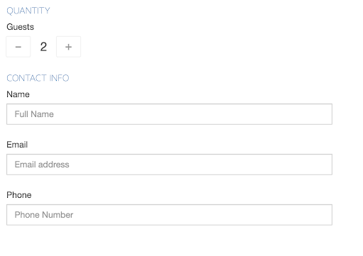
The key to a great checkout experience is to make it an easy process. Too many form fields can easily overwhelm your customers. Most bookings only require a few pieces of information. Let’s take an escape room booking, for example. Escape Room Mesa simply asks for the number of guests, followed by the name, email, and phone number.
To reduce the number of fields they need to fill out, consider:
- Only asking for the most essential information
- Using relevant input fields like providing guests with numbers for choosing quantity or a calendar for choosing a date
- Fitting the form fields on one page
7. Offer chat support

Live chat can help your customers before, during, and after they make a booking. This feature allows customers to speak to a real human and receive live customer support during their booking process.
Meanwhile, chatbots provide customers with automated customer support. They can instantly answer frequently asked questions like “Is there parking?” or “Do children get free admission?” This frees up your staff to focus on more important tasks. Today’s chatbots can also provide personalized recommendations and help you make more sales without any human intervention.
If it’s your first time using either solution, consider the following:
- Invest in a chatbot that personalizes responses to provide guests with relevant recommendations
- The chatbot should use humor to keep guests engaged
- The chatbot and/or your live support team should track the most frequently asked questions to address them ahead of time
- Consider which solution would make the most sense for your audience
8. Eliminate any unnecessary elements at checkout

Most checkouts have only a few steps, starting with customer details and ending with the final payment. Still, customers can get easily sidetracked by a busy sidebar or popup ad. Avoid distracting design elements, newsletter sign-ups, or pop-ups that can take your customer’s attention away from the current task. The Denver Adventures checkout page, for example, is very straightforward with zero distracting elements, which helps lower the chances that customers will float off the page.
Here are a few tips to accomplish this on your checkout page:
- Remove any sidebars
- Don’t promote your newsletter
- Eliminate pop-up ads
- Don’t provide guests with links that might take them outside of the checkout process
9. Add trust signals

The best way to make guests feel comfortable with sharing their payment information with you is to display SSL certificates, secure payment badges, and other social proof signals before and at checkout.
The SSL certificate is one of the most common, as it authenticates a website’s identity and ensures an encrypted connection. But there are other ways to display trust signals. You’ll notice that the checkout page in the example above has a security badge right next to the “Continue” button. The sole purpose of this badge is to ensure customers that their credit card information will remain safe after they book.
Social proof in the form of follower counts, customer feedback, and guest photos can also accomplish this. Here are a few more tips to instill confidence in your guests as they’re checking out:
- Display SSL certificates and secure payment badges on the payment stage
- Research and apply for relevant trust badges, such as with Tripadvisor
- Highlight positive customer reviews on your site
10. Send abandoned cart emails
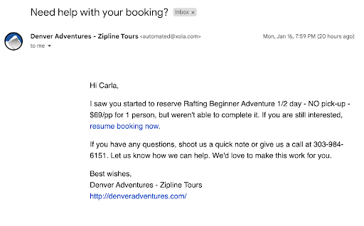
When a guest abandons a booking, the chances of them coming back on their own are slim. A reminder, though, can bring a good portion of them back to your checkout page. Abandoned booking emails are sent to guests who started a booking on your site yet for whatever reason, never completed it. These emails, like the example shown above, encourage customers to return to your website to complete the booking. They include a link that takes customers directly to the checkout page, allowing them to pick up where they left off.
Tip: Xola has used abandoned booking emails to help operators rescue hundreds of lost bookings and revenue.
11. Let guests know where they are in the checkout process

A progress bar tells your customers exactly where they’re at in the checkout process. If a guest is short on time, for instance, they’ll be relieved to find out that there are only three steps in HeliNY’s checkout shown above. Overall, this tactic gives guests a sense of ease and relief. When they feel that they’re just a couple of steps away from finalizing a booking, they’ll be less likely to abandon the process. Try this on your website by:
- Exploring the option with your booking software
- Adding the number of steps at the top of the page
- Allowing guests to move between steps
***
By following these tips, you can eliminate friction at checkout and increase direct bookings.