

When a customer is ready to book one of your tours, is it easy for them to complete the checkout?
Many will turn away at the slightest hiccup — like having to fill out one too many form fields or having to click the “back” button to double-check their activity details.
A well-designed booking page that functions smoothly can set your company apart from the competition.
In this post, we’ll explore the elements that make up a great booking page design that delights your guests and drives more conversions.
Why does booking page design matter?
If you look at your website analytics, you’ll likely find that the number of people who visit your checkout page doesn’t correspond to the number of finalized bookings. The travel industry has one of the highest cart abandonment rates, meaning that many people get to the final checkout page and never complete their booking.
Customers abandon their bookings for all sorts of reasons, and many turn away at the first sign of friction. For instance, 30% of customers abandon an online purchase if they have to re-enter their credit card information, and another 13% will leave if the checkout process is too complicated or has too many form fields.
This is why tour businesses need to optimize their checkout pages. Your booking page design can define whether a customer follows through with a booking or abandons their cart. There are two main components to your booking page design:
- User interface (UI) design: The visual elements that make up the look and feel of your checkout page, such as a clean layout, easy-to-fill-out form fields, and a progress bar.
- User experience (UX): Takes into account the user’s needs, goals, and pain points when designing the checkout journey from start to finish.
Both of these come into play when designing a booking flow that converts.
What should be on your tour or booking page?
Let’s explore the five crucial elements that every booking page should have.
1. A visible CTA
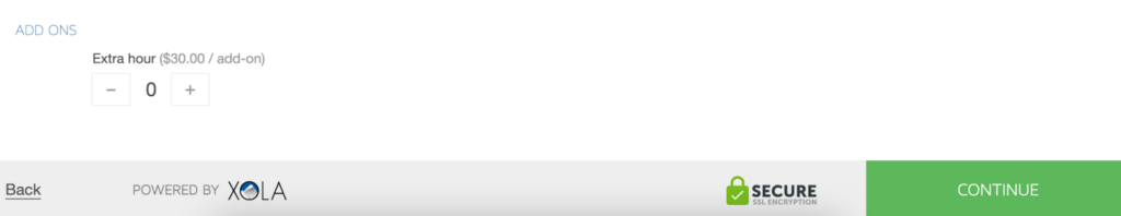
Your “Book now” button should stand out so that it’s one of the first things guests see when they land on your website. The same goes for when guests make it to your checkout page: Give them a clear path to complete the purchase by making the final CTA button stand out. You can accomplish this by making those buttons bigger and brighter than the rest of the text on the page, as Xola’s checkout does above.
2. Detailed Tour Description
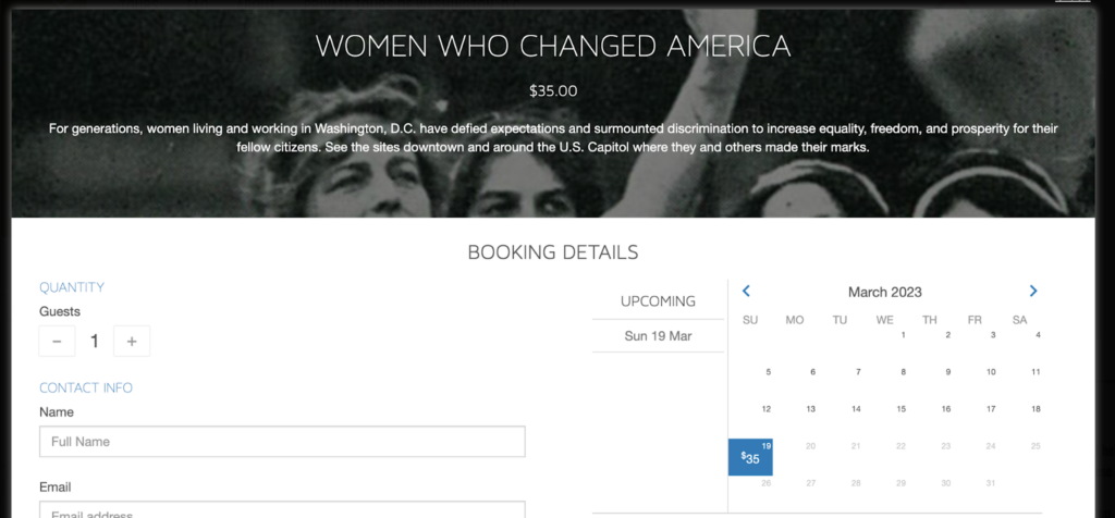
Give your guests a detailed tour description so they know what they’re signing up for. Include the date, time, and an engaging description of the experience they are purchasing — as walking tour operator Washington Walks does in the example above.
3. Images and videos
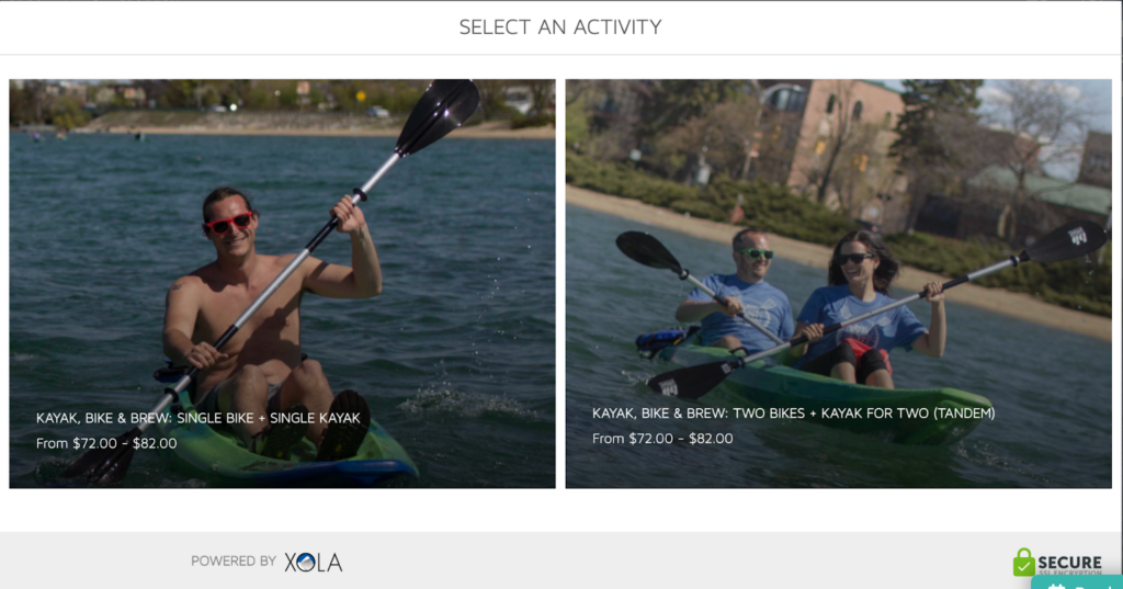
Photos and videos give potential customers a sense of what to expect on their tour. When they see past customers having a good time in your photos, they’ll be more excited to continue their booking. For example, Kayak, Bike & Brew chose photos of customers smiling on a sunny day.
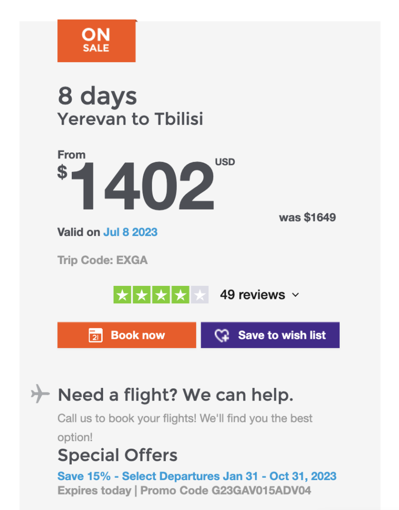
4. Social proof
Reviews give your company credibility and your customers the confidence to book. When the review corresponds to the specific activity they’re about to book — giving them that extra confidence to hit “Book now.” For example, group trip operator G Adventures includes a rating widget above its “Book now” button, allowing customers to read reviews before booking.
5 Booking Page Design Best Practices
A seamless booking flow requires a clean layout, white space, and visual consistency, among other design best practices.
1. Use a clean layout
Your booking checkout experience should have a clean layout without distracting design elements. Make sure to eliminate sidebars and pop-ads that may take customers to another part of your site. The sole mission of your booking page is to walk customers to the final payment stage, and a clean layout ensures customers can effectively interact with your website.
2. Add white space
This means using plenty of white space, also known as “negative space.” This is empty space around the content and functional elements of a page. For example, when you can leave the white space inside the field forms empty.
Here are a few other ways to leverage white space on your booking page:
- Remove borders
- Space out your letters
- Add space between elements, like the different form fields
3. Make sure the colors and fonts are consistent across your website and marketing materials
Strive to create a booking page that’s visually consistent with the rest of their website. Customers will identify your brand based on the fonts, colors, and buttons on your homepage. And your checkout page should align with that brand identity. website’s checkout page.
4. Display security badges on the checkout page
One of the best ways to make guests feel comfortable at checkout is to display SSL certificates, secure payment badges, and other safety cues on the payment page. Displaying positive reviews and photos of past guests on your homepage can also act as social proof, giving guests the confidence to book with you.
5. Keep the number of form fields at a minimum
Thirteen percent of people will abandon a travel booking if the checkout process is too complicated. We already explored the importance of a clean layout. Your form fields also play a key role in the checkout process. Too many of them can easily overwhelm your customers. Consider only asking guests for essential information like name, billing address, party size, and payment information. The quicker they can get through this stage, the closer they’ll be to finalizing their booking.
***
Designing a booking page that looks great and converts requires a combination of clean design and elements that enhance the user experience.
By implementing these best practices, your tour business can create a booking page that not only captures the attention of potential customers but also makes the booking process seamless and enjoyable.
Remember to regularly test and optimize your page to ensure that it’s performing at its best.